

Well. That was fun, wasn’t it?!
When I decided to jump into the One Room Challenge after years of following along, I had big hopes for my room – even though I knew I wasn’t going to be doing anything too extreme. I wanted it to feel moody and sophisticated, but also more intentional than the sort of cobbled together room I started with.
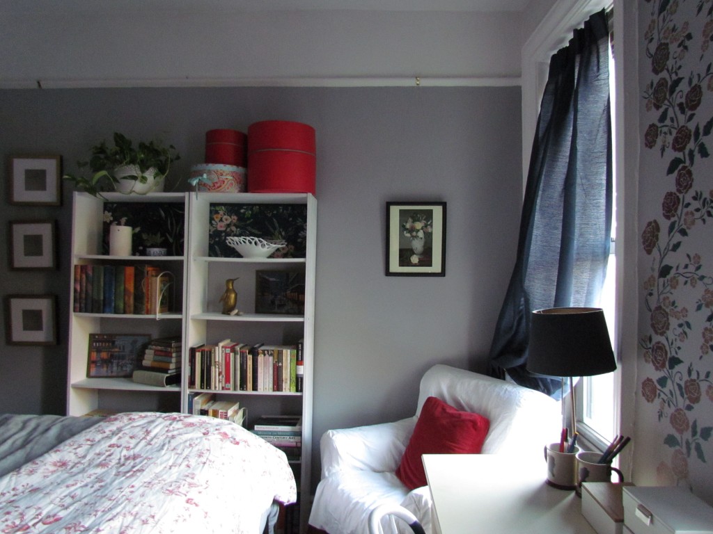
Before
Let’s revisit where I started:


Yikes. I know.
Let’s look past the pack-rattiness of it all and just move along. This is like those Nutrisystem “Before” pics where everyone’s in their frumpiest oversized t-shirt before they get a tan and suck in their stomachs. The One Room Challenge was the kick in the pants I needed to get organized and get rid of stuff so that I could have a room that would be relaxing. A space that I would enjoy spending time in, instead of one that made me feel anxious and annoyed! What a concept!
Because I’m living in a one bedroom NYC rental apartment, I was severely limited in what I could do (No demo! No major construction! Nothing I need to transport by car! Nothing I can’t carry up 5 flights of steps!). I was also hamstrung by the fact that my plaster walls and moldings literally have 33 layers of paint and skim coat on them. Doubt me? I have the microscopic cross-section photographs to prove it!

The historic colors I found were interesting, but I wasn’t about to re-create the way this room looked in the 1940s or 50s. It feels like all the paint glooped on my walls and trim reduced the square footage of this room considerably. But a rental was just not worth the time and energy it would take to clean up those moldings. So I’d just have to add more paint for the next tenant to deal with!
After
I’ve always loved blue and gray and I used them in the room previously, but with less intention. And since I wanted something a bit moodier, I decided to go darker. I’ll admit that I was a bit nervous about doing all navy for the walls, so I opted to just go with one darker accent wall facing the windows. The advantage of this is that you don’t see quite how dark I went until you’re fully in the room. The glimpse through the door of the gray walls (Behr “Flannel Gray”) is still quite a change and it’s something that’s even more dramatic and cozy at night. And then the white picture rail and cove at the top keeps it from feeling too heavy. I love how it all fits together. Even the stencil on the window wall picks up the gold, deep greenish-blue, and red colors used elsewhere in the room.

But then you turn and see that deep navy on the accent wall and it feels like you want to sink into it. At this point your feet are also sinking into my new rug. It’s a vintage, hand-knotted Turkish wool rug that I got from ecarpetgallery on ebay and it’s lovely – and such an upgrade from my old polypropylene rug that was flat as a pancake.

But let’s face it, the real star of the show is my dresser. From the minute I stripped the white paint off those drawers I’ve been looking forward to these final reveal photos with it styled up and beautiful. I never imagined that it would look this gorgeous. The wood absolutely glows now and gives a really beautiful warmth to the room in contrast with the cooler blues and grays.

I also like how the painted structure of the dresser changes color depending on the light and where you are standing in the room. In some cases the paint, Behr “Winter Way”, appears really blue, when it actually has a green undertone. Sometimes it looks much darker, closer to black.

This was another advantage of the gray walls. Against a navy wall, this dresser would probably fade into the background. But now it’s really a focal point in the room.

The accent wall is a different color (Behr’s “Starless Night”) than I used on the dresser, but it has the same effect. I love how the light from the windows alters the appearance over the course of the day. And then when I turn on my lamps at night, the painted gold lining on the shades gives it a whole new effect that’s wonderfully cozy and perfect for winding down the day.

I tried to reuse as much of what I already had as possible. This meant keeping my very basic, very budget Ikea bookshelves, but painting them white. The backing is painted Behr “Flannel Gray” to match the walls with the addition of some temporary wallpaper from Spoonflower on the top display shelves. I purchased these samples before I settled on doing the stencil for the window wall, but with the darker blue-green background they work perfectly for showcasing some of my milk glass and ceramics.

The vintage milk glass bowl is from the Doric Lace line by Westmoreland. I love how sculptural it is, so it makes a perfect focal point on this shelf. I also love the little brass penguin. He’s actually pretty hefty – I wonder if it had a purpose (like a doorstop) or if it was always just a figurine.
The two prints are actually printed images of vintage paint-by-numbers depicting wet and gray Parisian streets. I saw these images on Inspired by Charm‘s Instagram stories a couple weeks ago and thought they would be absolutely perfect for me. He picked them up for $15/each and I could only find a pair selling for $169/each on Etsy which was not in the budget. So I played with the images in photoshop, printed them, mod-podged them to canvas boards, and in-painted them myself! I’d love to find the real thing at a flea market someday, but for now, they are just the ticket!

My framed Medusa pictures look great between the bookshelves and one of my new nightstands.
Adding new curtains with brass holdbacks gives my west-facing window wall a much softer feel to complement the dark wall opposite. At night, they block more light than my old curtains and I got them for a ridiculous deal at Bed Bath and Beyond, so I’d call it an upgrade.

The floral motif in the stencil further softens the effect. The gold flowers use the same metallic paint (Pittsburgh Paints Metallic Tones “Bronzed Ginger”) I used on my refinished lamps. Ikea recently came out with the same Arstid lamps in a brass finish, which made me wish they’d had those when I first bought mine years ago! Using my acrylic artist paints, I added some crimson to the “Bronzed Ginger” for the larger flowers, then added some phthalo green to the paint from my dresser for the leaves.

The floral motif in the stencil further ties together the florals on the bookcase and in my favorite Manet “Peonies” print hanging above the slipcovered armchair.

I couldn’t find a slipcover that would fit this chair that wasn’t in a horrible color or fabric, so I made my own and covered it in a white cotton duck canvas. We used to have a pair of these chairs in my house growing up. When my mom was sick we moved one into the kitchen so she could sit comfortably with us. That chair was eventually so worn that it had to go and was replaced by its twin, which has now followed me around but is still incredibly comfortable. My dad had forgotten that I still had it and recently asked if he could have it back, but I said not a chance! Especially now that it has a nice clean new cover.
Changing out the builder-grade flush mount and replacing it with a pendant was just what this room needed. I never used the ceiling light before because the quality of light was awful, but now I use it all the time. It combines diffuse lighting, down-lighting, and up-lighting, and with one bulb it illuminates the room far better than the 2-bulb flush mount ever did. Plus, I didn’t even need to call my electrician step-sister for help!

Also in this view is my new friend, Ermengarde. I love how she’s giving some epic side-eye to everyone and everything from the new shelf I installed over my radiator, filling up a space that was completely wasted before. She vaguely looks like my mom (thankfully not named Ermengarde), whose presence is all over this room – from the dresser and the armchair to my newly color-blocked spindle chair that looks so cute, I can hardly stand it. I really think my mom would’ve loved what I’ve done. Ermengarde, however, is reserving judgment for the time being.

Styling the top of my dresser was a lot of fun. I incorporated a slab of white Calacatta marble salvaged from my Broadway theater restoration project. So as not to scratch the dresser, I added felt furniture pads underneath. And now it’s a perfect spot for my perfumes and lotions.


It’s not the only slab of marble I’ve repurposed. I’ve also got a piece of Portoro marble that was salvaged from another of my restoration projects at one of the bath houses at Jones Beach State Park. I keep some stuff out of landfill and get a nice piece of decor with personal significance to boot!
I love the box my Diptyque candle came in so much that I’m tempted to leave it in there forever to keep lightly scenting my room. Before I even picked out my bedroom colors, this box had them covered like it was meant to be. It was one of the best souvenirs I brought back from Paris this summer.

And then there’s the bed, which is really the whole point in here! Originally I wanted something along the (beautifully curved) lines of the Stella brass bed from West Elm, but I just couldn’t make it work with a box spring and I’m not ready to transition to a slat bed just yet. I needed something that could accommodate the box spring and give me storage space below and this brass bed from Wayfair fit the bill. It has similar curved lines and is much more modern and streamlined than a traditional brass bed.

I did get my West Elm fix though with this wonderful organic flannel herringbone duvet. Flannel Gray on the walls and gray flannel on the bed! It’s unbelievably soft and I sized up to king size so I could have a nice amount of drape over the sides and foot of the bed. I even added a striped lumbar pillow that picks up the rest of the colors in the room (even metallic brass!).
Flannel is great in the winter, but for summer I’ll be able to swap out the heavier fabrics for a lighter, summer- weight quilt that I’ve been working on. I think it’ll go great with the new decor in this room too!

I also made my own pillow cases for the bolster and the euro shams using Robert Kaufman Shetland Flannel Herringbone. It’s yarn dyed cotton so it’s not quite as heavy as the flannel on the duvet and it’ll wash nicely.
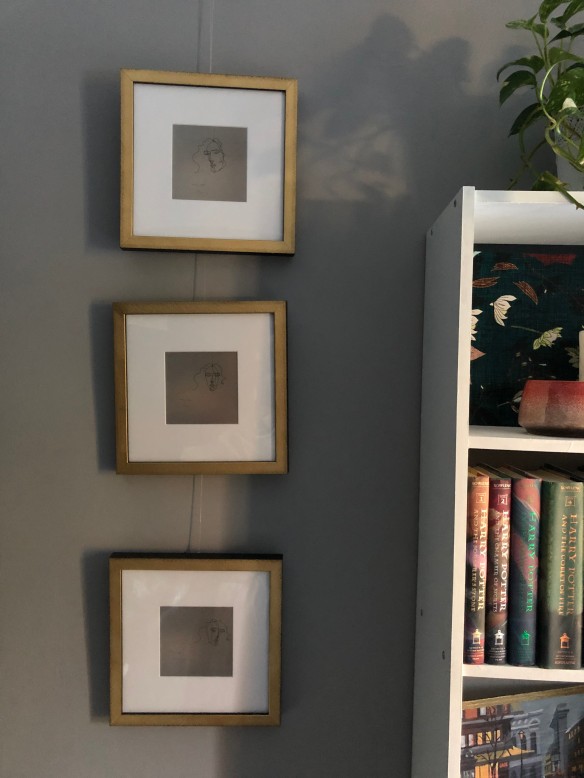
Just like in the old version of this room, I painted the art over my bed. I had planned to have a set of three, but the other two need a bit more work before I’m fully satisfied with them. It’s just as well, because I ran out of my clear hanging wire!

All in all I am so pleased. I managed to keep the things that were important to me and make them better and more functional and more beautiful. I upgraded items that were no longer serving me well. And I put everything together into a space that feels cohesive and well-planned.

I’m so happy that the One Room Challenge exists because it was just the thing I needed to motivate me to make this room better and more enjoyable. My only regret is that I’m now out of rooms to redecorate in this apartment. Guess I’ll just need to buy a house!
Now I’m off to check out the final reveals for everyone else who participated. This was such a wonderful experience for me and I hope anyone following along found it entertaining. It’s probably a lot better than living through a construction zone yourself!

Sources
Everything was bought and paid for by me (though I managed to get some great deals thanks to inheriting my mom’s skills at finding a good discount). All opinions are my own! I’ll see if I can do a budget breakdown this week to figure out how I did with my budget.
Paint Colors:
- Walls: Flannel Gray and Starless Night by Behr (matte finish)
- Trim and Bookshelves: Pure White by Glidden (eggshell finish)
- Dresser, Drawers, and Chair: Winter Way by Behr (matte finish)
- Lamps, shade lining, brackets, stencil: Bronzed Ginger by PPG Metallic Tones
Furniture:
- Bed: McMullen Metal Queen Bed (Wayfair)
- Nightstands: Metcalf 1 Drawer Nightstand (Wayfair)
- Dresser: Vintage Dixie Dresser (previously owned)
- Desk: Target (previously owned)
- Small chest of drawers: Vintage (previously owned)
- Bookcases: Ikea (previously owned)
- Spindle Chair: Vintage (previously owned)
- Armchair: Vintage (previously owned)
Decor:
- Rug: Vintage Hand-knotted Turkish Wool Rug (ecarpetgallery on eBay)
- Curtains: Pinch Pleat Window Darkening Curtains (Bed Bath and Beyond)
- Stencil: Meandering Rose Chinoiserie Stencil (Royal Design Stencils)
- Temporary Wallpaper: La Boheme Floral (teal medium) and Noir Floral (teal large) by Nouveau Bohemian (Spoonflower)
- Bedding: Organic Flannel Herringbone Duvet and Shams (West Elm)
- Lumbar Pillow: Roar + Rabbit Mixed Stripe Pillow Cover (West Elm)
- Vase and Faux Flowers: Anthropologie Terrain (Nordstrom)
- Vase: Nordstrom at Home Medium Metallic Glass Vase (Nordstrom)
- Lamps: Arstid Table Lamp (Ikea – previously owned in nickel-plated)
- Lamp Shades: Drum Lampshade (World Market – painted lining with PPG Metallic Tones paint)
- Medusa Art Print: Olympia Frame (Framebridge)
- Pendant Light: Abadie 1-bulb Globe Pendant (Wayfair)
- Shelf and Brackets: Ekby Hall brackets and Lack shelf (Ikea – previously owned – brackets painted with PPG Metallic Tones Paint)
One Room Challenge Fall 2019
ORC Week 1: Moody Blues Bedroom
ORC Week 2: All Dressed Up
ORC Week 3: Colorwork
ORC Week 4: Going for the Gold
ORC Week 5: Let There Be Light
ORC Week 6: You are Here!

It looks great! Love the marble pieces. But the highlight for me has to be the dresser and how well you’ve brought it to a new look.
Thank you so much! I love it too. Can’t wait to read your post and see everything you did!
loving the mix of colors in here!
Thank you! It was a lot of fun playing with colors in here!
What a difference! I love what you did with this room. I am always excited to read ORC reveal posts from people who work well with imposed limits like the apartment regulations you must abide by. Great job!
Thank you so much Stacy! It was tricky. I know a lot of people won’t even paint their walls – let alone paint them a dark color – because of their security deposits. But I really wanted to try to make it feel like more than a rental! Fingers crossed I can also get my money back when I move! 😂
Fantastic new look.. even though you were limited on what you can do, you made the most of it and gave it all the pizzazz it needed. Not to mention the marble slabs on your dresser were great added touches
Thank you!
This is a beautiful room! I particularly love Ermengard! Cheers to a great challenge!